
This is my Logo design for My snowboard company called ALP, My initials.


This logo i was looking for a clean flowy, kinda pop feel. I then decided to add the mountian to make it more of a winter feel for my snowboard
company.
This second logo i was looking for a continuous
in the clean, flowy logo but with a bit of fun mess added to it. Then i decided to add a feminine flare to it.
For this logo i was looking for more of a retro new look, with a bit of pop in it. The first was more clean cut so for the second i decided to add a bit
more fun pop to it.


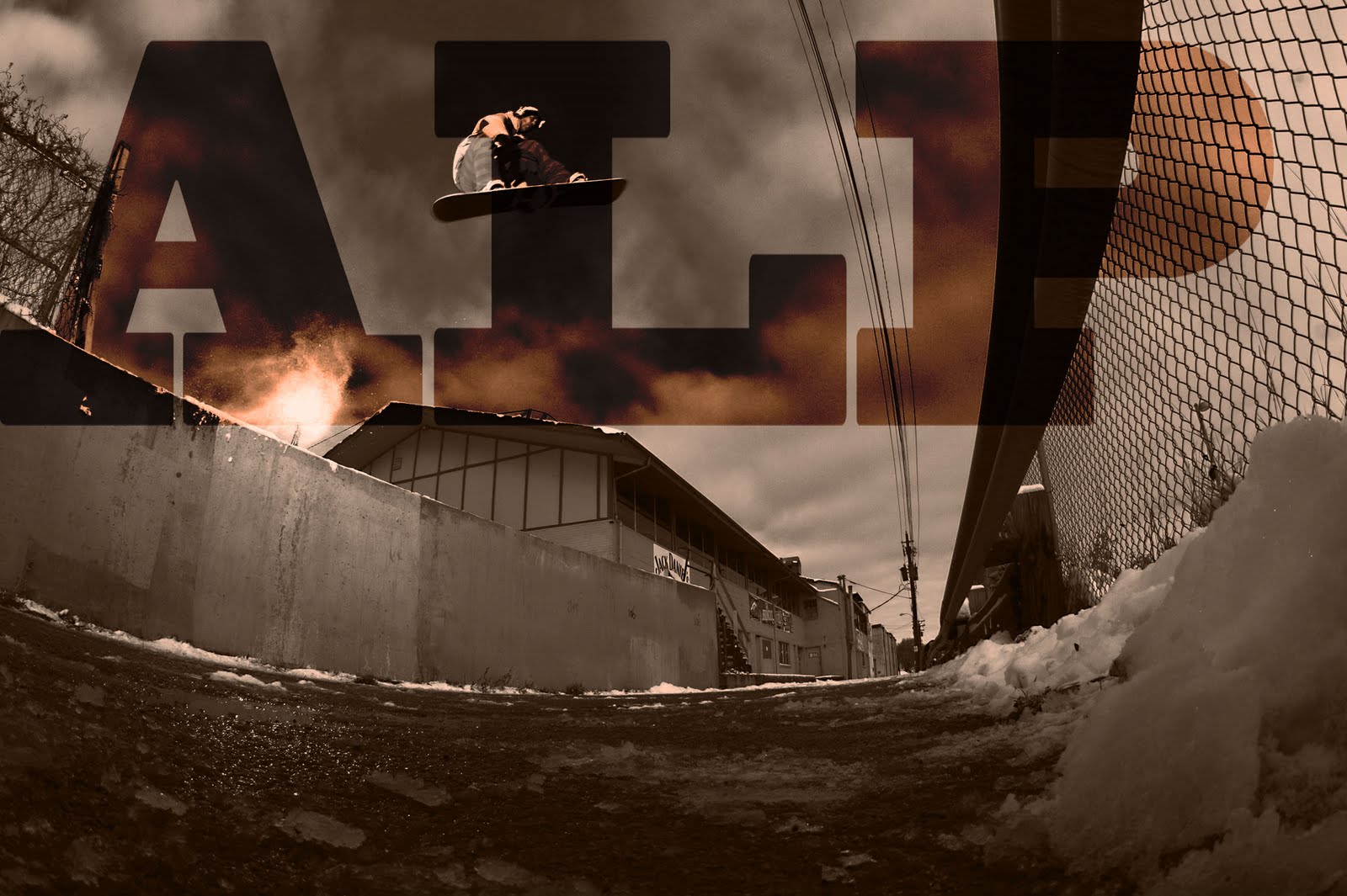


 This logo i was looking for a clean flowy, kinda pop feel. I then decided to add the mountian to make it more of a winter feel for my snowboard


